Hans Rosling, a world renowned medical doctor and statistician, spent a lifetime collecting health and wealth data from over 200 countries. This video is the result of that data assimilation compiled and animated to show and predict the average health and wealth for each country and continent. I find it fascinating to see how the United States ranks in comparison to the emerging superpowers.
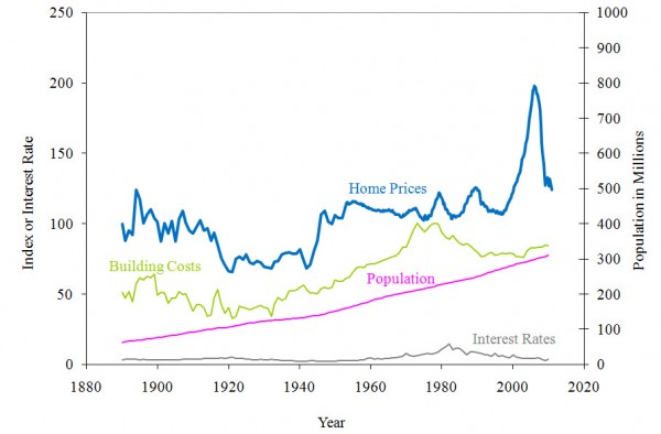
While the Hans Rosling video does not directly map real estate, the content matter certainly correlates. As I watched the United States rise during the industrial revolution and post WWI boom, I realized that I had seen statistical housing charts that mirrored the Rosling animation. In fact, Bill Marsh of the New York Times had recently mapped Robert Shiller’s historical home prices through 2006.
The anomaly that grabs my immediate attention is that both Rosling’s and Shiller’s data track very closely until 1998 when home prices outpace the average wealth exponentially. Granted, the Shiller data needs to be updated for the last 5 years, but until the average US home price in aggregate returns to 2000 levels +/- 2 years, we may continue to experience a very soft national real estate market. That does not mean don’t buy real estate. That means, buy real estate below replacement cost in the areas of historical desirability and you’ll be just fine. The American dream is still homeownership, but it’s no longer the white picket fence version.


